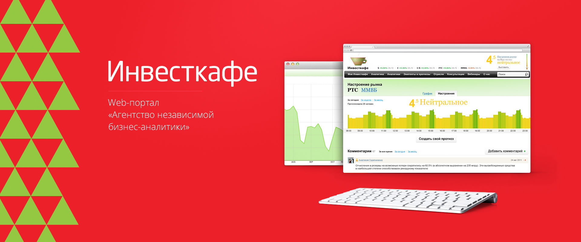


Website Analysis
 Today, in spite of weather conditions and political pre-clash, we continue the conversation begun in the past material – Basics of web-design. How to start developing a website? (it can also be found in the mailing list archive – the November issues) about how web design begins. How to start the design? with the development of a visual interface sketch? With a content management system design? With content analysis and site information architecture? Many developers have their own opinions, usually based on personal experience.
There are two groups of people directly influencing the work of a designer – customers and potential visitors.
The customer always requires a complex solution, with animated bells and whistles and effects – because in his view the main goal is to stand out among the competitors, to attract the attention of most of the valuable consumers of their goods or services.
As a rule, the visitor requires content of the site – information, services – which he can easily access thanks to the most understandable and accessible interface.
The task of the designer is to find a universal solution, a balance between visually spectacular graphics and an easy, accessible interface with a clear navigation structure.
As an example, I want to give a few projects. http://absolut.com/ – the site of the manufacturer of the famous brand of alcoholic beverage. The first page filters visitors of non-alcoholic age, and does not carry any information load. But the splendor that opens from the next page entrances even developers who are tempted by web projects (comments in the style – “maniacs did … but it was done cool !!! … a lot of freaky chips!”). Yes, flash-animation, everything is bright and expressive, like a holiday, it drives away, moves, winks … and makes it difficult to work. The employee of the company, the translator was given the task to find information about several brands from the manufacturer and translate them into their native language. The young lady with the task failed. At first she came across browser errors (an analysis of this project showed that the functionality was really implemented by complex scripts, in IE 5 and 5.5 some sections were not loaded, the Opera did not work at all, in Mozilla some “freaky chips” were not shown), but amazing was not that. With all the fabulousness of visual design, it turned out to be almost impossible to find specific information. The site navigation is implemented apparently in the form of a system of puzzles, something like an intelligence level test – and if the visitor does not collect the puzzle (due to the insufficiency of this IQ), then the description of the brand of alcohol is not supposed to be read. So, apparently, decided the developers of this nice project.
Unfortunately, many readers have not even downloaded the Absolute flash website. And for those who have booted, they still caused the emotions described in the last issue – everything is super, but it’s not clear 🙂 🙂 And the saddest thing in such projects is to find the html version of the site, to get to the information is almost impossible! And, as our readers noticed, “… cynicism when the” skip screen saver “button is also executed in a flash. Cynicism with perversions – when it appears at the end, after having to watch the entire video.” However, the company represented by this site does not feel defective, does not expect a decrease in the number of sales of its products, does not lose anything from the “far-fetched non-faultiness of the usability of its web representation”.
However, many flash sites provide the right solution – the separation of a multimedia presentation from the information version of the site. There is a mandatory button-link “Skip Intro” – which allows you to stop the presentation video, and still find the right document. Since even the most outstanding flash presentation can be viewed once, twice, maximum three times, then the public comes to work, and the visitor will only be annoyed by everything that prevents him from doing business. We in this case do not consider flash cartoons of the type “Masyanya” – here the flash animation for the sake of the flash animation itself, this is the information people followed to the mult.ru project – of course, download cartoons! However, if you consider each flash movie masyanya as a unit of information, and evaluate the project mult.ru as a whole, it can be noted that the developers have thought out the information architecture perfectly, the navigation is visual and convenient, and the information / graphics balance is almost optimal.
On the other hand, there are websites (for example, http://www.sql.ru), which, with a minimum of graphic design, have so clear information architecture, so light and unobtrusive design and such a large amount of necessary (specific audience) information, as their visitor statistics are high, and the visitors’ ratings are more than benevolent.
One of the tasks of a web developer is to systematize information and navigate through it so that visitors can most successfully find and process the data they need.