
User friendly interface
 When planning the structure of the navigation menu – consider well-known statistics, which states that the average user must find the final document in a maximum (!) Of three steps (three clicks), i.e. if you use so-called. “sequential navigation” (when the user must select the section of interest to access the document X, then go to document 2, then to the document … X-1) – your visitor may never get to the information he needs . Why?
Here you should take into account the level of intelligence, and the amount of patience, and the very possibility of a long surfing the site. In the end – you should just respect the visitor, save his personal time. A businessman who came to your site and for the minimum number of steps could not find a price list with prices for your products, easily go to your competitors, whose online representation is more optimized for real work. The buyer, who has money and is ready to leave it in your electronic store, but who has not received enough information about the product you are looking for, will always be able to buy it on the neighboring site.
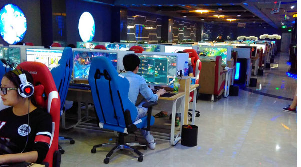
If the target audience of your project is teenagers, do not forget to take into account the peculiarities of information perception in children and teenagers. According to web-usability guru Jacob Nielsen, insufficient reading abilities, simplified work strategies, and a dramatically reduced level of patience prevent adolescents from tracking large amounts of text — hence, give information in batches and provide illustrations (since even textual information that cannot be held) attention of the young “reader”), it is desirable to supply the navigation with graphics, and the entire site with interactive elements – tests and polls, games and forums …
Already among the developers has developed such a thing as “familiar interface” – i.e. when all the design elements of the page meet the expectations of the visitor, they are in those places where the visitor is ready to see them, and function as the visitor expects. In most cases, the development of design within the “standard” interface significantly increases the likelihood of “success” of the resource. And if an unusual, creative design can please the eye of connoisseurs, cause admiration among professionals, then for the average user he can remain a mystery, which one doesn’t really want to solve, because (see above) is lazy, once, incomprehensible. .. While a more traditional design solution may be popular precisely because of its “clarity” and ease of use.
To structure navigation in such a way that a visitor can always find the desired document on the site in the minimum number of clicks – a rather complicated task. However, there are a number of traditional elements, which, as part of the design of the interface or being functional elements, can simplify surfing your site. These elements include, for example, the logo of your project (company, product …) – and the standard solution in this case is to place the logo in the upper left corner of the page and make it a link to the main page of the site. Thus, wherever the user is at any time, he can always return to the starting point, just by clicking on the graphic image, which he traditionally will search in the upper left corner. Such a decision may be * not obvious * for a beginner, but an experienced surfer will be familiar and helpful.
If the site navigation has a hierarchical structure – when there is a main menu, each of the elements of which contains a second level menu (child element), the designer has the task to design and implement the site navigation so that the user is not lost and not confused in the section hierarchy / subsections. In some cases, developers implement drop-down (pop-up) submenus. The advantages of this solution are that it is easy for even inexperienced users to surf the Internet – to use the drop-down menu – in almost any windows application, editor, and even a toy, we see the navigation that was formed in this way. The minuses are in the implementation complexity (developers use various technologies, applets, scripts, css capabilities) and it comes out very awkwardly when the site visitor doesn’t support css2, or javascript is disabled, or the developer didn’t bring anything to full cross-browser – and as a result – the visitor does not receive a link to the subsection or document he is interested in; the site loses the visitor (subscriber, partner, customer …).